
I recently took the plunge into learning CSS animations, and I’m so glad I did. I had so much fun learning how to add an animation to one of my cat illustrations, and I’m excited to share it. This post will explain the basics of CSS animations, as well as how to add a floating animation to an image.

Let’s get started
For context, I added this animation to a blog application built in Rails using ERB to display content to the client. You can view the app here. I wanted the cat to float on top of each page so I added the image inside of the body tag. The Rails image_tag method returns an HTML image tag for the source.
<body>
  <%= image_tag "rescuecat-transparent-large.png", class: "cat" %></a>
</body>
The code above generates the following HTML:
<body>
  <img class="cat" src="/assets/rescuecat-transparent-large.png" />
<body/>
Let’s dig into how I created an animation using the cat class I included in the image_tag above. CSS animations need two things:
- the animation declaration
- the keyframes that define which properties get animated, when they get animated, and how they get animated
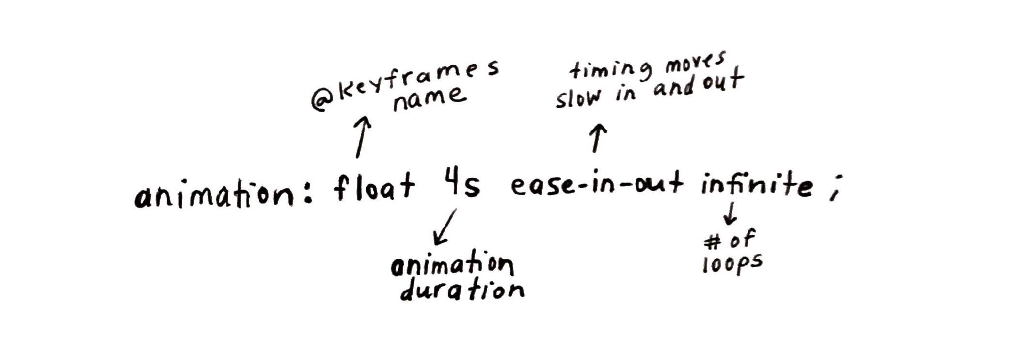
In the cat class below, notice that the size of the image is declared (width: 200px;). This only changes the size and doesn’t impact the animation. You can also see that the animation is declared with 4 properties: animation: float 4s ease-in-out infinite;. Below that, you can see the @keyframes block.
.cat {
animation: float 4s ease-in-out infinite;
width: 200px;
}
@keyframes float {
0% {
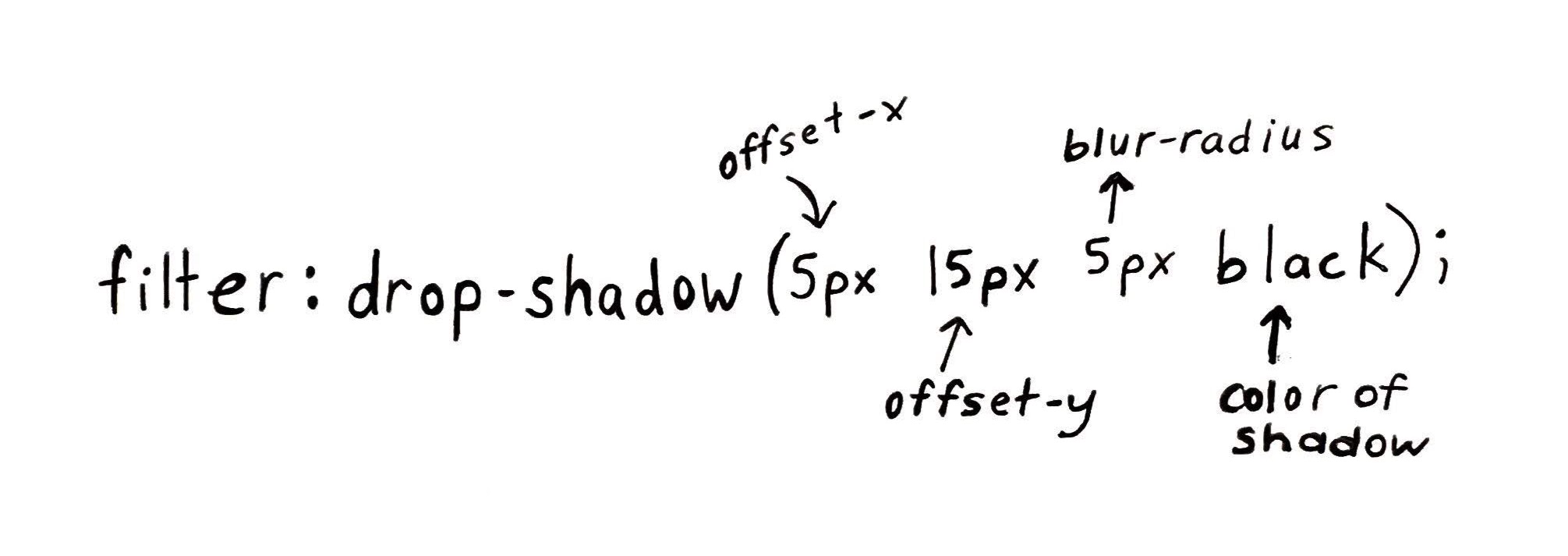
filter: drop-shadow(5px 15px 5px black);
transform: translateY(0px);
}
50% {
filter: drop-shadow(25px 30px 15px black);
transform: translateY(-10px);
}
100% {
filter: drop-shadow(5px 15px 5px black);
transform: translateY(0px);
}
The animation declaration
According to MDN, the animation CSS property is a shorthand property for the following properties: animation-name, animation-duration, animation-timing-function, animation-delay, animation-iteration-count, animation-direction, animation-fill-mode, and animation-play-state. Whew, that’s a lot of properties. For the case of the floating cat, I’m only using the following animation properties:
- animation-name: float (this refers to
@keyframedefined below) - duration: 4s (this refers to the numbers of seconds your animation will take from start to finish)
- animation-timing-function: ease-in-out (this refers to the timing as your animations begins and ends)
- animation-iteration-count: infinite (this refers to the number of loops your animation will run before stopping)
There are other options for each of these animations properties that you can experiment with when creating your own animations. If you have questions about the ease-in-out property, I recommend reading more about it here.
The keyframes
The keyframes are where you really get to control things in your animation. You first start with the @keyframes rule followed by a declaration of the name of the animation (in this case, float). Inside the @keyframes rule, you can see that 3 percentages have been declared followed by a block of code containing properties and their declared values. These percentages represent the waypoints along the animation sequence.
Let’s break this down. The 0% selector contains a block of values that execute at the beginning of the animation. The 50% selector contains a block of values that execute at the halfway point. The 100% selector contains a block values that execute once animation is complete. At each of these waypoints, we have two properties: filter and transform. Notice the first two blocks execute the same values, while the midway block executes a change.
You can experiement by setting different waypoint percentages. They are executed in the order that they appear.
According to MDN, the filter CSS property lets you apply graphical effects like blurring to an element. Filters are commonly used to adjust the rendering of images. I used the drop-shadow() CSS function to apply a drop shadow effect to the cat image. I applied the following parameters to the drop-shadow() function.
- offset-y - (required) specifies the vertical distance
- offset-x - (required) specifies the horizontal distance
- blur-radius - (optional) If not specified, it will be 0 creating a sharp shadow.
- color - (optional) Depending on the broswer, there will be a default color.
I changed the values at the halfway waypoint, so that the shadow would look fuzzier and more distant as the image floated up.
Note, there is also an optional fourth value that would come before color called the spread-radius.
According to MDN, the transform property lets you rotate, scale, skew, or translate a given element. In this case, I used the translateY() CSS function to declare the position of the cat image vertically on a 2D plane. I did this because I wanted the cat to float up at the halfway point and float back down. If I wanted the cat to float horizontally, I would’ve used the translateX() CSS function.
That’s a wrap
In summary, all CSS animations must have the animation property declared and keyframes that define the when, what, and how of your animation properties. There are many more properties beyond the ones discussed in this post and there are also many CSS functions that allow you to have quite a bit of control over how your animation works.